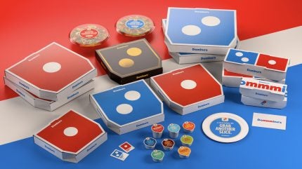
Domino’s Pizza has introduced its first brand refresh since 2012, updating visual and audio elements across its consumer touchpoints.
The redesign draws on the brand’s history and present identity.

Discover B2B Marketing That Performs
Combine business intelligence and editorial excellence to reach engaged professionals across 36 leading media platforms.
The new elements will be implemented over the coming months across the US and a number of markets globally.
Rollout channels encompass television and digital advertising, dominos.com, the Domino’s ordering app, print materials, boxes, in-store graphics and team member apparel.
Domino’s global chief marketing officer Kate Trumbull stated: “Over the past decade, we became known as a technology company that happens to sell pizza.
“But with our Hungry for MORE strategy, we’re bringing the focus back to making and delivering the most delicious products and experience, which is what Domino’s customers really want.
“Rather than launching a more traditional tagline, we’re baking craveability right into our name and every aspect of our brand as a reminder of this focus.”
Among the changes is a new audio-visual jingle, described by Domino’s as a “Cravemark”.
The jingle, which stretches and bends the brand name into “Dommmino’s,” features the voice of singer-songwriter Shaboozey.
Shaboozey stated: “Pizza is that one food that brings everyone together – different people and generations and cultures – and no one does it better than Domino’s.
“It was a fun challenge to be the voice for the most craveable food.”
Packaging has been revised, with an updated suite of boxes designed to showcase the Domino’s logo in a simpler format.
Boxes for its Handmade Pan and Parmesan Stuffed Crust offerings will present a more premium treatment, using black and metallic gold versions of the logo.
Domino’s is retaining its red and blue colours but has evolved them to hotter shades.
The new typeface, called Domino’s Sans, is thicker and incorporates circular forms and semi-circles as a nod to shapes of pizzas.
The refresh also extends to dominos.com and the ordering app, brighter digital and print materials, refreshed in-store graphics and team member uniforms.
The changes will help shape how the brand introduces future menu innovations and other consumer-facing elements.
In April 2025, Domino’s Pizza reported a 2.5% increase in revenue for the first quarter of 2025, amounting to $1.11bn, in comparison to $1.08bn posted in the same period of 20224.
This growth is primarily attributed to enhanced US franchise advertising revenues, an uptick in supply chain revenues and increased international franchise royalties and fees.


